
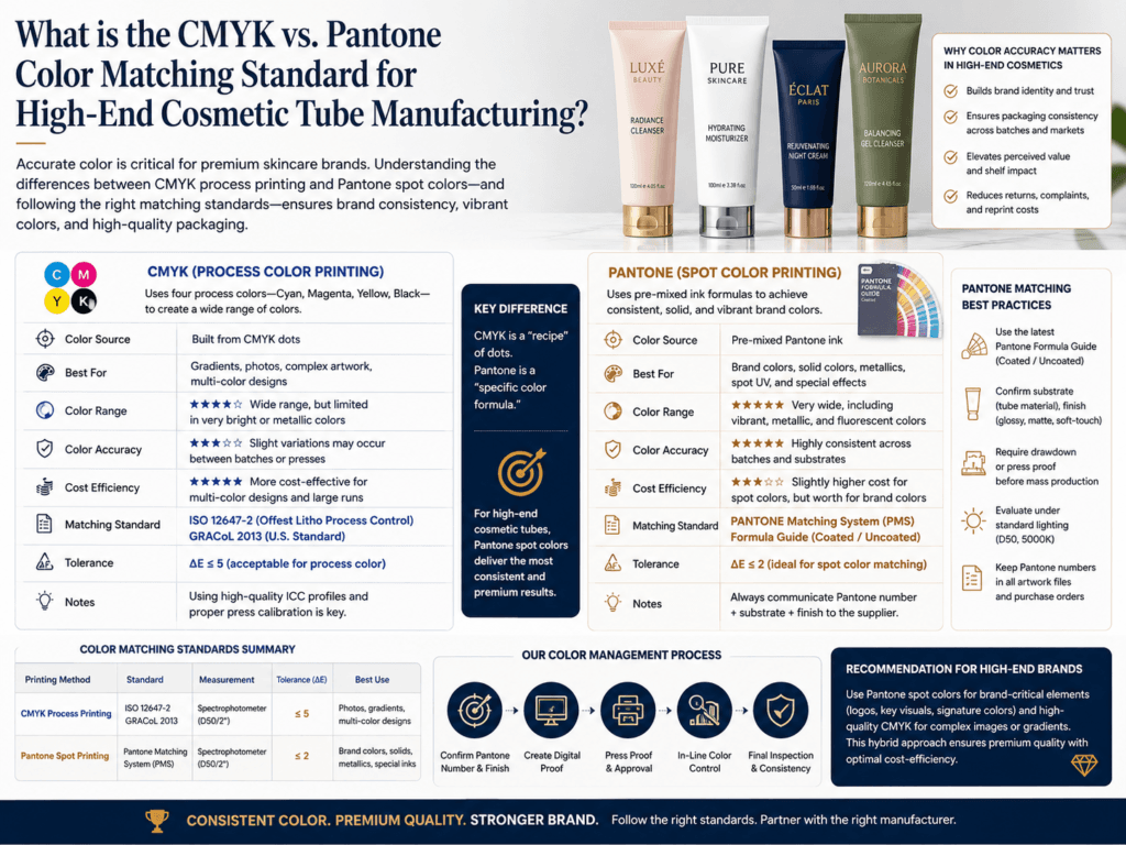
In high-end cosmetic tube manufacturing, CMYK and Pantone are not competing “standards” in the sense that one replaces the other. They are two different color production approaches used for different goals. CMYK is the standard four-color process system used for full-color printing, images, gradients, and complex artwork. Pantone is usually used as a spot-color reference system when a brand needs a more specific, recognizable, and repeatable color target.
For premium cosmetic tubes, the practical standard is usually this: use Pantone for brand-critical colors and CMYK for full-color artwork. When brand owners want the tube color to match a logo, signature green, luxury beige, or specific skincare-brand white as closely as possible, Pantone spot color is often preferred. When the design includes gradients, images, botanical art, or multi-tone beauty visuals, CMYK is usually more efficient and commercially practical.
What Is the Difference Between CMYK and Pantone?
| Color System | How It Works | Best Use in Cosmetic Tubes |
|---|---|---|
| CMYK | Uses Cyan, Magenta, Yellow, and Black process inks to build color | Full-color graphics, gradients, images, multi-color designs |
| Pantone | Uses a pre-defined spot color target for more exact matching | Brand logo colors, signature shades, strict visual consistency |
What Is the Practical Standard in High-End Cosmetic Tube Manufacturing?
- Pantone for brand-critical solid colors: Best when exact brand identity matters.
- CMYK for image-based or complex artwork: Best for gradients, photography, and multi-tone decoration.
- Color-managed production workflow for both: Premium packaging usually requires measured proofing, approved master samples, and repeatable print control.
- Process control standards for print production: High-end projects often rely on controlled proofing and stable production parameters to keep repeat orders more consistent.
When Pantone Is Usually Better
| Brand Need | Why Pantone Is Preferred |
|---|---|
| Luxury logo consistency | Helps keep the same recognizable shade across repeat orders |
| Signature brand color | More suitable when a color must look the same from batch to batch |
| Minimalist premium packaging | Often stronger for clean, solid, exact-looking brand colors |
| High brand-control requirement | Better reference point for factory, proof, and customer approval |
When CMYK Is Usually Better
| Artwork Type | Why CMYK Is Preferred |
|---|---|
| Gradients and tonal transitions | Built for process-color image reproduction |
| Botanical or photo-like visuals | More practical than multiple spot colors |
| Complex multi-color decoration | Commercially more efficient for rich graphics |
| Artwork with many hues | Reduces the need for many separate spot colors |
Why CMYK and Pantone Do Not Always Match Exactly
CMYK and Pantone do not share the same color range. Some bright, clean, or unusual Pantone colors cannot be reproduced exactly in standard CMYK. That is why a brand color may look excellent as a Pantone spot color but slightly different when converted into a four-color process version.
Best Practice for High-End Cosmetic Tubes
- Approve a physical master sample: Especially for luxury skincare and makeup tubes.
- Define whether the job is spot-color critical or process-color driven: This decision should be made before artwork separation.
- Use color-managed proofing and measurement: High-end cosmetic tube projects should not rely only on screen previews.
- Do not assume the screen color equals the print color: Premium tube projects should be validated under real production conditions.
Recommended Decision Rule
| Project Goal | Recommended Color Approach |
|---|---|
| Exact logo or brand shade | Pantone spot color |
| Image-heavy full-color artwork | CMYK |
| Luxury minimal packaging with one or two key colors | Pantone preferred |
| Complex artwork with a critical brand color | CMYK + Pantone spot combination |
Summary
For high-end cosmetic tube manufacturing, the practical standard is usually Pantone for exact brand colors and CMYK for complex full-color artwork. Pantone is better when color identity must be tightly controlled, while CMYK is better when the design relies on gradients, images, and multi-color composition. Premium factories usually support both approaches within a color-managed workflow using proofing, measurement, and repeat-order control.
Learn more: Printing Options, Printing Design, Tube Decoration, How do cosmetic tube manufacturers prevent color shifting?, Customize Cosmetic Tubes, Premium Skincare Packaging Tubes.
Need More Accurate Color Matching for Cosmetic Tubes?
Xinfly Packaging helps brands choose the right color strategy for cosmetic tubes, including Pantone spot matching, CMYK artwork setup, proof approval, and repeat-order color consistency.