
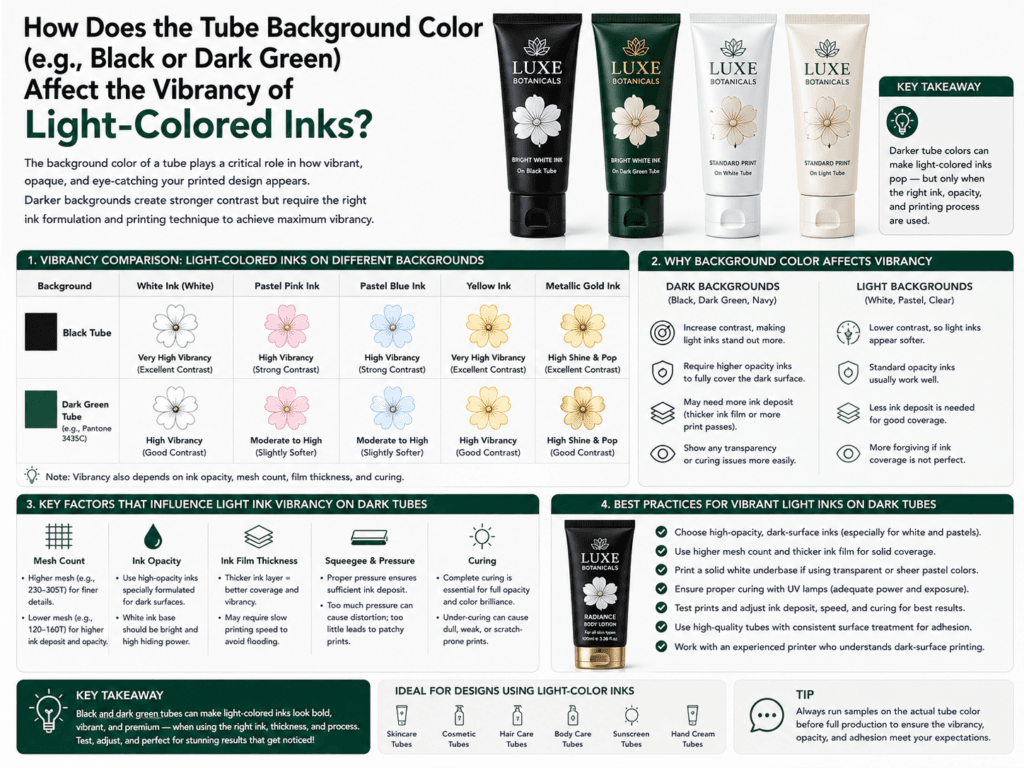
The background color of a cosmetic tube has a major impact on how vibrant light-colored inks appear. On black, dark green, navy, or other deep-colored tubes, light inks such as white, pale pink, pastel beige, light yellow, mint, or soft metallic shades usually look less bright unless the print structure is designed to compensate for the dark base underneath.
In simple terms, dark tube colors absorb visual brightness. If a light-colored ink is printed directly onto a dark substrate without enough opacity or without a white underbase, the color often looks weaker, dirtier, duller, or slightly shifted. That is why the same pastel artwork can look fresh and vivid on a white tube but much flatter on a black or dark green tube.
Why Dark Tube Colors Reduce Ink Vibrancy
| Background Condition | Effect on Light Ink | Typical Visual Result |
|---|---|---|
| Black tube | Strongest contrast challenge | Light colors may look darker, weaker, or less clean |
| Dark green tube | Can influence undertone perception | Pastels may look muddier or slightly color-shifted |
| Navy or dark blue tube | Absorbs brightness under thin ink laydown | Soft colors may lose freshness and appear cooler |
| White or light tube | Supports clean reflectivity | Light inks usually appear brighter and more accurate |
What Happens If You Print Light Ink Directly on a Dark Tube?
- Lower brightness: The color may not pop as expected.
- Reduced opacity: Dark substrate influence can show through the ink layer.
- Color shift: Pale tones can look dirtier, cooler, or less true to the approved artwork.
- Uneven visual effect: Fine details and soft tones may lose clarity faster than bold dark colors.
How Manufacturers Improve Vibrancy on Black or Dark Green Tubes
| Solution | How It Helps |
|---|---|
| White underbase printing | Creates a brighter foundation so the light ink is not contaminated by the dark background |
| Higher-opacity ink system | Improves coverage and reduces substrate show-through |
| Adjusted color formula | Compensates for dark-base visual influence |
| Multiple print passes | Builds stronger color density when needed |
| Artwork simplification | Helps small pale details stay clearer and more stable |
Why White Underbase Is So Important
For most light-colored artwork on dark cosmetic tubes, white underbase is the key step. It works like a visual barrier between the dark tube body and the pastel or light-toned ink printed above it. Without this layer, many soft colors will appear weaker or shifted. With a strong underbase, the final color can look cleaner, brighter, and closer to the intended design.
Which Light Colors Are Most Affected?
- White
- Pale pink
- Light beige or nude
- Pastel yellow
- Mint green
- Light blue
- Soft lavender
- Very light metallic shades
Best Design Recommendations for Dark Tube Backgrounds
| Design Goal | Recommended Approach |
|---|---|
| Maximum color vibrancy | Use a white underbase under all light-colored artwork |
| Premium minimalist design | Use fewer light colors and give them enough size and spacing |
| Soft pastel branding | Test actual printed samples instead of relying only on screen proofs |
| Luxury contrast look | Combine strong white, metallic, or bold light accents with controlled dark backgrounds |
Common Mistakes to Avoid
- Using pastel colors on black tubes without white underbase
- Expecting screen artwork to match direct print results on a dark substrate
- Using very fine pale details that are too delicate for dark-background printing
- Approving colors without checking real production samples under normal lighting
Summary
Black, dark green, and other deep tube background colors usually make light-colored inks look less vibrant unless the decoration system is designed properly. The darker the tube background, the more likely pale inks are to appear duller, less opaque, or slightly color-shifted.
To keep light colors bright on dark cosmetic tubes, manufacturers usually rely on white underbase, higher-opacity inks, adjusted color formulas, and real sample approval before mass production.
Learn more: Printing Options, Printing Design, Black Cosmetic Tubes, White Cosmetic Tubes, Tube Decoration, How do cosmetic tube manufacturers prevent color shifting?
Need Better Color Vibrancy on Dark Cosmetic Tubes?
Xinfly Packaging helps brands optimize dark tube decoration with white underbase strategy, ink opacity control, and sample-based color adjustment so artwork looks brighter and more premium in real production.