Published: .
Hand cream tube spot colour swatch cleanup starts with a simple question: do the colour names in the artwork describe the inks that the buyer intends to order? A design can look like one wine-coloured print while its editable file contains several similarly named spot swatches, process-colour objects and technical guides. A supplier receiving only a screen image cannot reliably infer the intended separation plan from that appearance.
This guide provides a swatch inventory and a supplier handoff checklist. It focuses on identifying and resolving file ambiguity before quoting and proofing. It does not supply an approved ink formula, a colour tolerance or a universal number of printing operations. The designer and print supplier must confirm the actual process, output requirements and physical appearance for the proposed tube.
Define the intended decoration before counting colours
Keep the body, cap and printed ink separate
For hand cream tube packaging, identify the tube body colour, closure appearance and intended printed design in separate fields. A coloured plastic body is not automatically an ink separation in the artwork. A metallic-looking cap is not evidence that the tube file needs a metallic print channel. These are different parts of the packaging specification.
State whether the design is intended as a solid-colour screen print, a full-colour process design or another arrangement to be confirmed with the supplier. Do not ask a designer to simplify the file before the production intent is understood. A process-colour image and a solid brand mark can require different treatment within the same project.
Identify the actual file being reviewed
Keep the editable file, linked artwork and exported proof connected through a revision identifier. An inventory from one version cannot establish the contents of another export. Record the filename and revision used for the supplier discussion, and preserve the original before making authorised changes. A cleanup should leave a traceable revision rather than silently replacing the only source file.
Inventory the swatches and their roles
Ask the designer to list the spot swatches used by actual artwork objects, along with process-colour content and any technical channels. A long swatch list alone does not tell the supplier which swatches are used. Conversely, an apparently simple front-panel logo may reference a differently named swatch from text elsewhere in the file.
For custom hand cream tubes, map each intended printed element to the proposed ink or process treatment. Include the front mark, back text, decorative lines and any other relevant objects. The inventory should explain the intended role of a channel instead of relying on colour names that were inherited from an earlier design.
Treat similar names as questions, not automatic duplicates
Names such as “Brand Wine” and “Wine Copy” may represent an accidental duplicate, an intentional alternative or a swatch used in a different component file. Ask the designer to establish which situation applies. Do not merge swatches just because their screen previews look alike, or assume that different names necessarily require different physical inks.
Use a proposed alias map for approval
The following entries are fictional file labels showing how to organise the discussion. They are not actual ink specifications or a required naming convention. The action column records a question for the designer and supplier; it does not authorise a change. Replace these examples with the names and objects actually present in your file.
| Existing file item | Intended role to establish | Proposed action for approval |
|---|---|---|
| Brand Wine | Main brand mark and text | Confirm the approved master colour name |
| Wine Copy | Decorative lines or an imported mark | Check whether it should reference the same intended ink |
| Process-colour logo version | Alternative artwork or intended process content | Identify which version belongs in the released design |
| White artwork object | Unprinted substrate, white ink or another intended role | Ask the supplier to define the required treatment |
| Foil or finish channel | A separate decoration instruction if applicable | Preserve the approved technical meaning |
| Cut line or layout guide | Non-artwork technical reference | Confirm exclusion from the intended printed design |
| Unused swatch | No current artwork object | Record whether removal is appropriate for the released file |
Record why a name changes
If two items are confirmed as the same intended ink, record the approved destination name and the objects affected. If they remain separate, record the reason. A later designer should be able to distinguish a deliberate separation from a leftover duplicate. Keep the mapping with the revised file so the supplier can understand the cleanup without reconstructing it from email comments.
Review separations rather than a composite image alone
Adobe's guidance on printing colour separations describes process-colour and spot-colour output and the use of separation previews. This supports a narrow file-review principle: inspect how the artwork separates, as well as its combined screen appearance. The guidance is not a tube-specific print specification or proof that a particular press setup is suitable.
Ask the designer or prepress operator to review the relevant channels in the actual artwork and supplied export. Record which objects remain visible in each intended separation. If a logo disappears from the expected channel or a technical guide appears where print is expected, resolve that observation before releasing the file. Keep the review tied to the actual export settings.
Keep software controls within the supplier's workflow
Applications can offer settings that convert spot content to process output or change how separations are produced. Do not treat a convenient checkbox as a substitute for an approved production instruction. Ask the print supplier which output arrangement it needs, then have the responsible designer prepare and review that deliverable. Interface details can vary with software version and workflow.
Check linked and placed artwork
An imported logo or placed graphic may introduce a different colour definition from the surrounding design. Include relevant linked artwork in the review rather than checking only the text typed directly into the tube layout. Ask the designer how the final supplied file carries those objects and whether its separation result matches the intended ink map.
Do not recreate a brand mark by tracing a low-resolution preview just to remove an inconvenient colour name. Obtain or use the correct authorised artwork source. A file cleanup should preserve the approved lettering and design while resolving the colour definitions that the production workflow requires.
Inspect the export that will actually be sent
After an authorised cleanup, inspect the exported deliverable as well as the editable source. Keep the revision, export format and supplier requirements connected. A screenshot of the revised swatch panel does not establish that the exported file retains the intended channels. Ask for an appropriate output review from the person responsible for prepress.
Keep technical channels out of casual colour counting
White ink, foil, varnish and technical guides can have different purposes. Do not delete a named channel merely because it increases the count in a file inventory. Establish what it means in this particular job and whether it belongs in the supplier's production deliverable. A non-printing layout guide should be identified clearly, while a required decoration instruction should remain traceable.
Use the tube printing and design service to discuss the actual decoration process and file preparation requirements. Ask the supplier to state its interpretation of the proposed ink map. A purchasing estimate of “one colour” should not override a production requirement that the supplier has identified and explained.
Compare quotations against the same released scope
An enquiry for 30ml hand cream tubes still needs an artwork and decoration basis. Two offers are difficult to compare if one supplier interprets the design as a solid-colour print and another interprets the submitted file as a different separation arrangement. Send the same approved reference and ask each supplier to identify the scope used for its quotation.
The checklist below links the quotation to the artwork review. It does not assign a setup charge or predict the effect on price. Ask the supplier to explain any quotation difference for the actual design rather than assuming that removing a swatch automatically reduces production cost.
| Check | Record to send or request | Question to resolve |
|---|---|---|
| Decoration intent | Body, cap and intended print description | What physical appearance is being requested? |
| Artwork identity | Editable and exported revision references | Which file supports the offer? |
| Used colour definitions | Approved ink map and relevant object inventory | Are similarly named items intentional? |
| Technical channels | Clear role and output instructions | Which guides or decoration instructions remain? |
| Export review | Actual separation review reference | Does the deliverable preserve the intended plan? |
| Supplier interpretation | Confirmed print scope and open questions | What has the supplier included in its quotation? |
| Proof requirement | Agreed proof purpose and approval owner | What still needs physical or technical review? |
Approve appearance through the agreed proof process
A tidy ink map makes the request clearer, but it does not demonstrate the final appearance on a curved tube. Agree what proof or sample is needed and which part of the decision it supports. Identify the substrate, decoration and artwork revision represented by a physical reference, and keep that evidence separate from a screen preview.
Through packaging sample development, ask what can be provided for the proposed design and which later checks remain. Record the actual approval scope. Do not add an ink tolerance, adhesion result or completed specialist review to the file unless that evidence has been supplied and assessed for the project.
Use the posters to show a coherent print brief
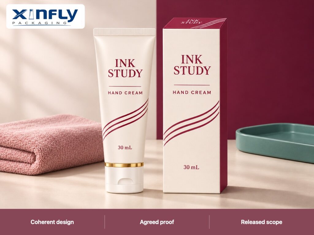
The INK STUDY posters use a warm-white PE-style tube, moulded shoulder, straight crimped tail and closed white flip cap with a narrow metallic-looking rim. Wine-coloured wording and three curves illustrate a single-colour screen-print-style design, coordinated with the printed carton. The image appearance does not establish the colour channels in an editable production file.
Share the approved ink map and current artwork with your OEM or ODM packaging enquiry. Identify the open questions that need a designer, prepress operator or supplier decision. A clear handoff gives those people the same problem to solve while keeping the quotation and proof scope visible.
Frequently Asked Questions
Can identical-looking spot swatches be merged automatically?
First establish their intended roles and the objects that use them. Similar screen appearance is not sufficient evidence of identical production intent. Have the responsible designer and supplier approve a mapping, preserve the original and review the revised deliverable.
Does a coloured tube body count as a print colour?
Keep the substrate and decoration specifications separate. A moulded body colour is not automatically a separation in the artwork. Ask the supplier to identify the actual printing scope instead of counting every visible colour in a packaging photograph.
Should every technical swatch be removed?
No. Identify whether it represents a guide, white ink, foil, finish or another job-specific instruction. Confirm the required output treatment. Remove or change items only through an approved cleanup that preserves necessary production information.
Does a clean swatch list prove that the exported file is correct?
Review the actual export and its separations against the approved intent. Linked graphics and output settings also matter. Keep the file revision and review reference so the supplier can identify the deliverable that was approved.
Will fewer swatch names always produce a cheaper quotation?
Do not infer a price change from the file inventory alone. Ask the supplier which physical printing and setup scope it has quoted. Compare offers using the same released artwork and request a clear explanation of any proposed production difference.
Conclusion
Clean up spot-colour ambiguity by mapping actual artwork objects to approved ink names, preserving technical instructions and checking the supplied export. Connect that record to the quotation and agreed proof process. Send Xinfly Packaging the current artwork, intended decoration and unresolved colour questions to establish a reviewable print brief before ordering.