
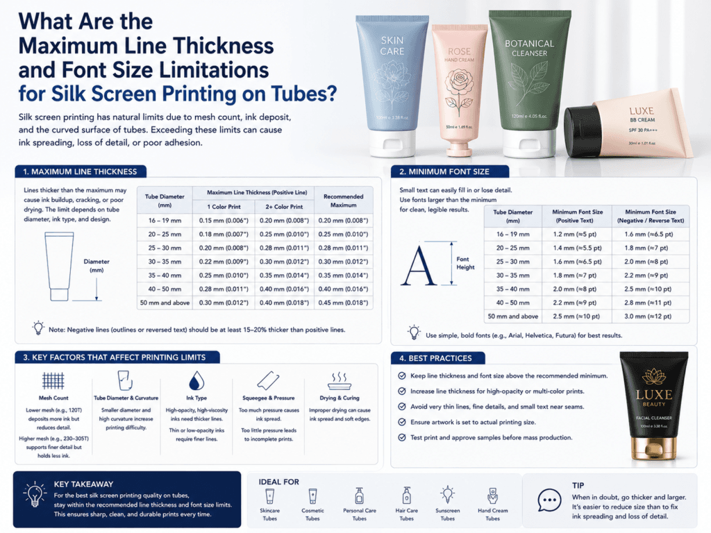
For silk screen printing on cosmetic tubes, there is usually no strict “maximum line thickness” limit in normal artwork. Thick lines and large fonts are generally easy to print. The real technical limitation is the minimum line thickness and minimum readable font size that can still hold clean edges, resist ink spreading, and remain legible on a curved tube surface.
In practical tube printing, manufacturers usually focus on safe artwork ranges rather than absolute theoretical limits. For many commercial screen-print jobs, a minimum positive line thickness around 0.13 mm to 0.30 mm is often a workable range, while a minimum text size around 6 pt to 8 pt is usually more reliable for clean production, depending on font style, tube diameter, ink opacity, and whether the text is positive or reversed out.
Quick Answer: What Are the Practical Limits?
| Artwork Element | Typical Practical Guideline | Comment |
|---|---|---|
| Minimum positive line thickness | About 0.13 mm – 0.30 mm | Safer lines usually print more consistently on curved tubes |
| Minimum text size | About 6 pt – 8 pt | Sans-serif fonts usually perform better than fine serif fonts |
| Negative / reversed-out detail | Should be larger than positive detail | Small counters and gaps can fill in more easily |
| Maximum line thickness | No strict normal maximum | Usually limited by design balance, not print capability |
Why Minimum Limits Matter More Than Maximum Limits
- Screen printing handles bold graphics well: Thick logos and large type are usually easy to transfer.
- Fine details are the real risk: Very thin lines can break down, spread, or print inconsistently.
- Tube curvature makes small artwork harder: Cosmetic tubes are not flat, so tiny elements become more sensitive.
- Ink deposit is heavier than some other print methods: This is great for bold opacity, but can make ultra-fine detail harder to hold.
What Affects the Minimum Printable Line and Font Size?
| Factor | How It Changes the Limit |
|---|---|
| Tube diameter | Smaller diameters usually need larger and safer artwork |
| Font style | Thin serif fonts are riskier than bold sans-serif fonts |
| Positive vs negative artwork | Reversed-out text usually needs larger gaps and bigger letters |
| Ink type and opacity | Heavy, opaque inks can fill in very small detail more easily |
| Surface finish | Matte, textured, or difficult substrates may require stronger design tolerances |
| Multi-color registration | Tight multi-color detail usually needs more generous line widths |
Recommended Safe Design Ranges for Cosmetic Tubes
- Positive line art: Use at least 0.25 mm or more when possible for better consistency.
- Small text: 7 pt to 8 pt is usually safer than pushing to the absolute minimum.
- Reverse text: Increase font size and spacing because small openings may fill in.
- Micro details on small tubes: Enlarge artwork more aggressively on 16 mm–19 mm diameters.
When Problems Usually Happen
| Problem | Likely Reason |
|---|---|
| Text becomes hard to read | Font is too small or too thin for the tube size |
| Lines look thicker than expected | Ink spread or normal screen-print deposit on very fine artwork |
| Negative spaces disappear | Reverse detail is too small and fills in during printing |
| Edges look soft instead of sharp | Artwork is too delicate for the actual mesh / ink / tube combination |
Best Practice for Artwork Approval
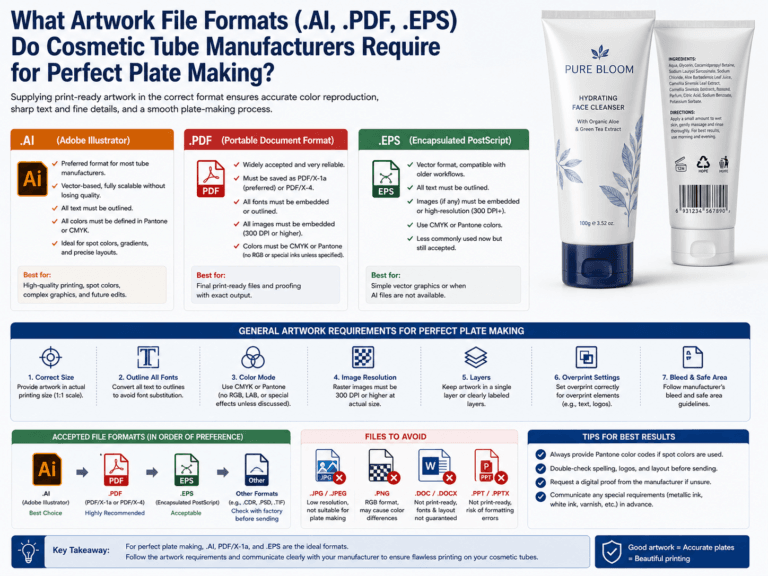
- Convert all text to outlines before submission
- Use vector artwork instead of raster text when possible
- Print the artwork at actual size for visual review
- Ask the tube manufacturer to check the smallest text and line areas before sampling
- Approve a real production sample, especially for small-diameter tubes or reverse text
Summary
For silk screen printing on cosmetic tubes, the main design limitation is usually minimum line thickness and font size, not maximum size. In practical commercial work, 0.13 mm to 0.30 mm is a common reference range for minimum positive lines, while 6 pt to 8 pt is a common practical range for small text, depending on the font, tube size, and print conditions.
For the safest result, beauty brands should treat these values as starting points and use larger, bolder, and simpler artwork whenever premium clarity is important—especially on curved, small-diameter, or dark-colored tubes.
Learn more: Silk Screen Printing Tubes, Printing Options, Tube Decoration, Design Area Dimensions, Silk Screen Printing vs. Offset Printing, Customize Cosmetic Tubes.
Need Safer Artwork Specs for Silk Screen Printed Tubes?
Xinfly Packaging helps brands adjust line weight, font size, artwork spacing, and print layout so cosmetic tube graphics stay sharper, cleaner, and more production-friendly.