Published: .
The artwork looks crisp on your laptop. Then the decorated hand cream sample arrives, and the back-panel copy takes an uncomfortable amount of effort to read. Nothing was misspelled. The problem is that a large flat screen and a small curved package ask very different things of the same lettering.
A 30ml hand cream tube text legibility proof connects the artwork file to a physical reading decision before you commit to printed stock. Start with the proposed hand cream tube packaging, then agree what the proof must demonstrate. This guide provides a feature-review sheet and an approval handoff. It does not prescribe labeling requirements or a universal minimum font size for every market and printing process.
Decide What You Are Approving
Separate Correct Copy from Readable Printing
A copy check confirms that the approved words, symbols and quantities are present. A physical readability check asks whether the intended reader can distinguish them on the actual decorated pack under the agreed conditions. Keep those decisions separately visible. A spelling approval should not silently become approval of the print’s size, contrast or position.
Identify which text matters to the current review: product identity, directions, capacity, variant name or another part of the approved copy. Assign a copy reference and an artwork revision. The supplier can then discuss a particular feature instead of trying to interpret “make the small writing clearer” across several changing files.
Identify the Intended Reading Condition
Ask the brand team how the relevant panel is expected to be read. Define a practical viewing condition with the people responsible for the project, including lighting, orientation and whether the tube is empty or filled. Record the conditions used. A development discussion needs repeatable observations, not an unexplained judgement from a phone photograph.
Verify the Scale Before Looking at Typography
Check That the Paper Proof Is Actually Full Size
Printer settings can change the apparent size of a proof. Include an agreed dimensional reference and check it against the artwork’s intended scale. A sheet marked “100%” is less useful if nobody verifies the result. Keep the reference separate from the printed tube’s manufacturing dimensions so the two checks are not confused.
Here is a hypothetical scale check: a reference intended to print at 60 mm measures 54 mm on the paper proof. That sheet is at 90% of the intended linear scale. A 6-point element scaled in the same way would become 5.4 points geometrically. These are arithmetic examples, not recommended dimensions, type sizes or legal labeling limits.
Treat Point Size as One Description, Not the Whole Decision
Two typefaces at the same point size can present different character shapes and spacing. Keep the actual font, weight and artwork treatment attached to the proof. Ask the decorator which production features need review. Reducing the issue to one point-size number can hide the distinction between a design that reads comfortably and one with easily confused characters.
Review the Features Most Likely to Cause Confusion
Look at Character Shape and Spacing
Choose representative words and characters from the actual approved copy. Look for letterforms or numerals that could be confused in context and for gaps that become difficult to distinguish. Describe the feature and location in the observation sheet. This gives design and production teams a concrete issue to assess without requiring a reader to guess which line you mean.
Do not invent replacement product wording while reviewing legibility. Any change to the copy should return to the responsible copy owner. Keep a proposed font or spacing adjustment distinct from an approved content change. Otherwise, an attempt to improve readability can introduce a new text error into an otherwise correct panel.
Include Reversed Text and Fine Outlines in the Review
Light lettering inside a dark printed field and thin outline characters deserve their own observations when they appear in the design. Ask whether their detail remains distinguishable in a representative decorated sample. The relevant question is how the actual artwork and process reproduce the feature, not whether every reversed-text design should share the same numerical rule.
| Feature to review | Observation to record | Relevant follow-up |
|---|---|---|
| Product and variant name | Whether the intended words are distinguishable at the agreed view | Confirm hierarchy and correct variant copy |
| Small text blocks | Specific characters or lines that are hard to distinguish | Review actual font, spacing and process reproduction |
| Reversed lettering | Detail visible within the printed background | Ask designer and decorator to assess the treatment |
| Fine outlines | Whether the intended shapes remain separate | Compare the relevant artwork feature with the sample |
| Curved side areas | What is visible as the tube is turned normally | Review panel position on the actual body |
| Near shoulder or tail | Whether geometry or the agreed print boundary affects the copy | Refer to the current drawing and decoration layout |
Check the Curved Tube After the Flat Proof
Follow the Text Around the Actual Body
For 30ml hand cream tubes, ask for the actual proposed body and closure references. Nominal capacity does not establish body diameter, length or the available print layout. Review how the copy sits on that body, including areas that turn away from the viewer. A flat wraparound proof cannot show every aspect of how a curved surface will be handled and read.
If the sample state changes the body shape, record that state. The team should know whether it reviewed an empty tube, a representative filled pack or another preparation. Keep the approved drawing and the physical reference together. An attractive rendering of a similar tube should not replace the identified assembly in the final approval record.
Discuss the Shoulder and Tail Boundaries Early
Use the supplier’s agreed drawing and decoration layout to identify boundaries relevant to the text. Ask the decorator which features need attention near those areas. Do not create a safe-zone dimension from a poster or assume that one tube’s print boundaries apply to another. Resolve those references before the designer packs essential copy into the last available space.
Match the Proof to the Proposed Printing Route
Keep the Process and Finish Identified
The sample request should state the intended printing method, body color and relevant surface treatment. A proof made by another route may still be useful, but its approval scope should be clear. Use Xinfly Packaging’s tube printing and design information to discuss which proof can meaningfully represent the proposed decoration.
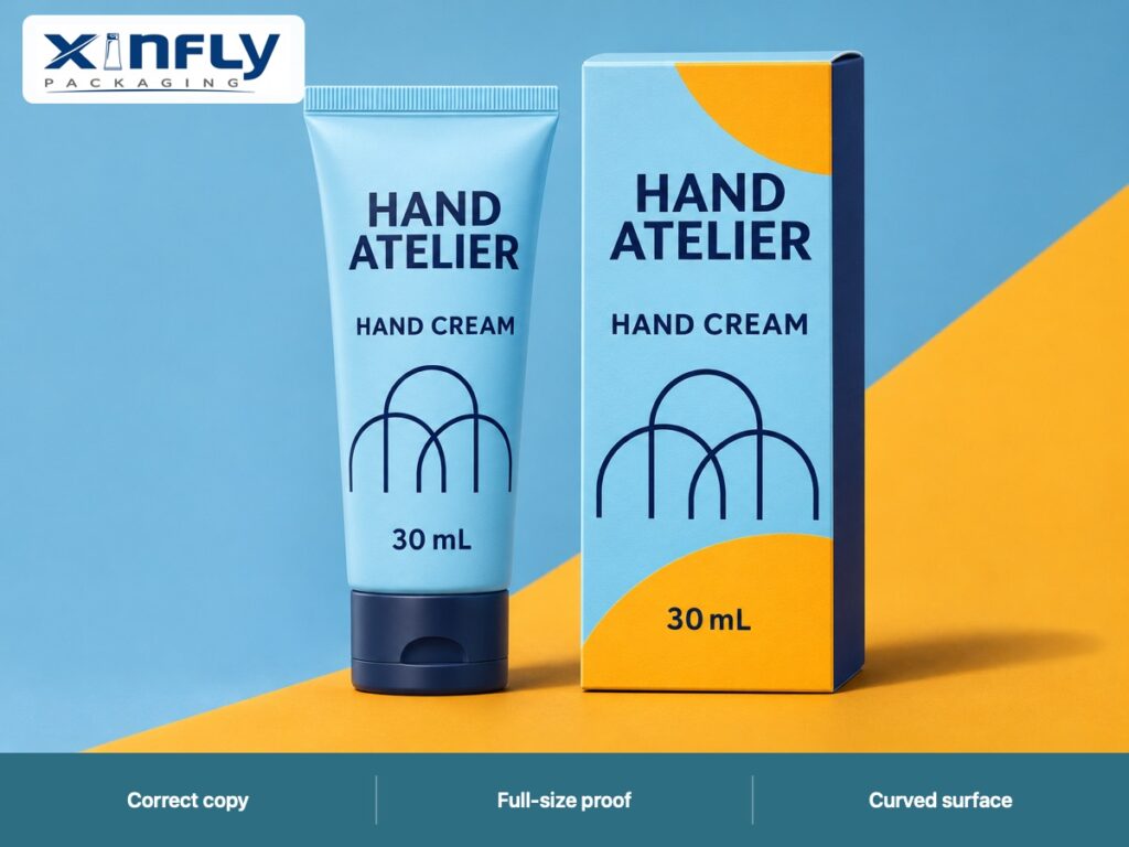
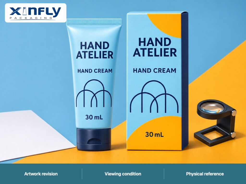
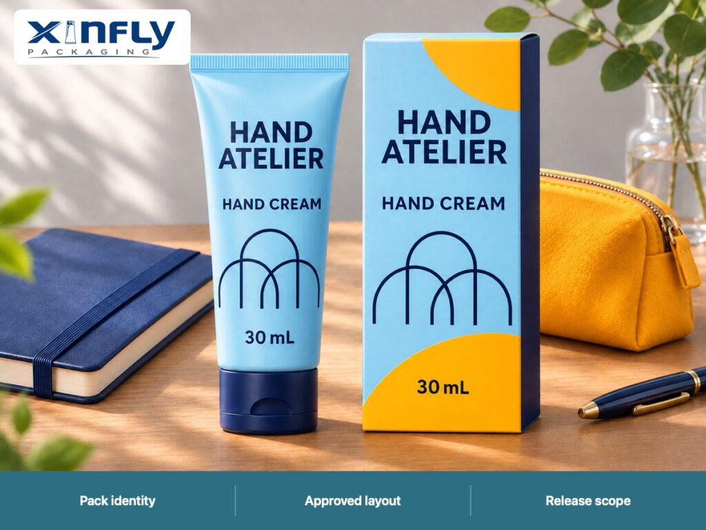
The HAND ATELIER illustrations show a sky-blue nominal 30 mL PE body, molded shoulder, straight sealed display tail and navy flip-top, with navy one-color screen-printed names and arches. The matching carton adds marigold artwork. The illustrations demonstrate the coordinated design; they are not fine-print samples or evidence that a particular small-text layout has passed production review.
Request Process Feedback on Specific Features
Xinfly’s screen-print line and font detail guide is a relevant background reference when discussing screen printing. Ask the decorator to review the actual file and identify any features needing adjustment or a representative trial. Keep the project’s approved feature limits in its own record rather than adopting general guidance as a blanket acceptance rule.
Use Photographs to Support the Physical Reference
Avoid Letting Enlargement Decide the Outcome
A close-up image can help colleagues locate a problem, but enlargement changes the reading task. Label whether a photograph is an overview or a detail view and keep the sample identity attached. Ask the team to distinguish a feature seen only under magnification from the intended normal-view readability decision.
Photographs also depend on lighting, camera settings and reflections. If pictures are used for comparison, keep the setup reasonably consistent and retain the physical reference where practical. The project should state which decisions require the actual sample. A highly sharpened image on one reviewer’s display is a weak replacement for an agreed pack-reading condition.
Release Corrections with the Artwork Revision
Record the Change and the Feature Rechecked
If the team adjusts type size, font, contrast or position, identify the new file and the affected features. Recheck what the change could influence, including neighboring copy and layout boundaries. Avoid approving a corrected detail crop while leaving the complete revised panel unreviewed. The release should point to one complete artwork revision and the sample scope that supports it.
| Release field | Record to retain | Question it resolves |
|---|---|---|
| Copy reference | Approved content and responsible owner | Which wording is correct? |
| Artwork revision | Complete print file and scale reference | Which layout is being released? |
| Pack identity | Body, closure and drawing references | Which curved package was reviewed? |
| Decoration route | Printing method and relevant finish | What reproduction does the proof represent? |
| Viewing record | Conditions, sample state and actual observations | How was readability assessed? |
| Open items | Unresolved features and assigned owners | What still needs a decision? |
| Approved scope | Accepted features and order reference | What may purchasing release? |
Keep Label Compliance as a Separate Review
Readability feedback is useful input for the people reviewing the product label. It does not establish that every required statement, placement or dimension complies with every target market. Give the responsible reviewer the actual copy, artwork and pack information. Record their decision if obtained, and keep pending review visible instead of adding a reviewer who did not participate.
Send Xinfly Packaging a Proof Brief That Can Be Quoted
Include the File and the Decision Needed
For custom hand cream tubes, send the assembly reference, complete artwork, copy revision, intended printing route and the particular readability questions. Use sample development to discuss the available proof states and preparation. Confirm who supplies, reviews and retains each sample, along with project-specific quantities, costs and timing.
Ask the proposal to distinguish artwork adjustment, a flat proof and a decorated physical sample where those are separate activities. Send Xinfly Packaging your artwork and proof requirements with the intended market and order scope. A precise brief makes it easier to compare what each offer actually includes before committing to printed components.
Frequently Asked Questions
Is a readable PDF enough to approve small text on a tube?
A PDF supports file review, but it cannot settle every physical reading question on a curved decorated pack. Identify what each proof represents and use a representative sample for the decisions that require it. Keep the file and sample revisions connected.
What is the minimum acceptable font size for a 30 mL hand cream tube?
This guide does not set a universal minimum. Review the actual typeface, artwork, printing route, pack geometry and target-market requirements with the responsible teams. A single nominal capacity cannot determine all of those conditions.
Should magnification be used in the review?
It can help locate reproduction detail if the method calls for it. Keep that inspection separate from the agreed normal-view readability task. Record which observation was made under which condition rather than treating a magnified photograph as the whole approval.
Can the carton proof approve the tube’s copy presentation?
The carton and tube have different surfaces and layouts. Shared wording still needs to be correct, but approval of the carton’s presentation does not automatically approve the tube. Identify each artwork file and the packaging surface it covers.
What should be retained for a repeat order?
Keep the approved copy, complete artwork revision, tube drawing, decoration route, relevant physical reference and actual release decisions. Review any changed input before repeating the order. An old product name alone is not a sufficient reference for the approved text presentation.
Conclusion
A useful readability proof links correct copy, verified scale and the actual curved package. Record the features that need attention, review them under agreed conditions and release one identified artwork revision. That gives Xinfly Packaging and your buying team a practical basis for discussing whether the printed hand cream tube communicates the information your project needs readers to distinguish.